Some people say variety is the spice of life. They like to change it up, try new things, experiment.
Set designers for family-oriented sitcoms are clearly not those people.
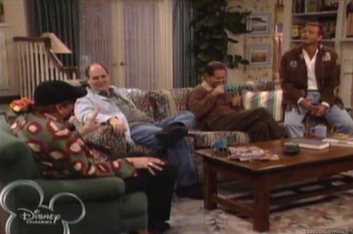
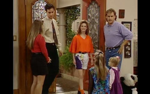
Whether due to pure laziness or merely relentless resourcefulness, I do not know, but the sitcom has one classic living room setup which varies only slightly--if at all-- from show to show.
Family Matters, Growing Pains, Full House, Kenan and Kel, Boy Meets World...even newer Disney shows like Good Luck Charlie are keeping the sitcom layout alive.
To show you what I mean, allow me to take you on a mental tour of the sitcom living room. Visualize it with me.
Our journey begins at the left side of the set.
To your far left, you will first see the front door. Opening to the fake outside world and usually featuring a fancy window, this door has consistently let in unwanted characters, nosy neighbors and police officers returning rebellious children episode after episode. An optional addition to the front door is a platform which lets down into the living room itself (see: Full House). It's not a requirement, but it has been known to make an appearance more than once.

As we turn our gaze slightly to the right, you will soon notice a staircase. Most often the lower steps are set facing the audience, then the upper steps curve to the right as they ascend, sometimes creating a hallway overlooking the living room. The staircase is perhaps the feature which displays the most variation in design, but is always in the same spot relative to the door.
Moving right along, in the center of the room you will see a couch facing you. It may be bright blue, it may be plaid, it may be floral. It is, however, never leather (that is too high-class to be relatable). This couch is often where characters watch TV, have sentimental chats whilst gentle string music plays, sit awkwardly with boyfriends while the father asks questions, you name it. If it happens in the living room, chances are it will take place on or around this couch. (There's also usually a table behind the couch with vases and lamps and books and whatnot.)

Finally as we make our way to the far right of the living room you will notice a door to the kitchen. But not just any door, oh no. A swinging door. Always. Every time. I have yet to see a sitcom in this style with a real door and/or no door at all to the kitchen.
Much like the platform, a pass-through is also optional on the wall separating the kitchen and the living room. This allows characters in the living room to easily interact with characters in the kitchen, for example, when a clumsy character has been sent to prepare food and needs to assure the gathering in the living room that everything is fine, when, in fact, it is not fine. Or when someone needs to spy on a conversation they aren't supposed to hear which is taking place in the living room. I have seen this most often in Disney Channel or Nickelodeon sit-coms.
NOTE: The Cosby Show also follows this formula, except in the mirror image. It's the paradox of the sitcom universe, varying from the formula yet keeping it exactly the same.

This concludes our imaginary tour of 90s sitcom living rooms. I hope you enjoyed your experience. Please be sure to take your belongings with you on the way out.
What's your favorite family sitcom?